SQL Interview Questions and answers – 2021
1. What is DBMS?
A Database Management System (DBMS) is a program that controls creation, maintenance and use of a database. DBMS can be termed as File Manager that manages data in a database rather than saving it in file systems.
A Database Management System (DBMS) is a software application that interacts with the user, applications, and the database itself to capture and analyze data. A database is a structured collection of data.
A DBMS allows a user to interact with the database. The data stored in the database can be modified, retrieved and deleted and can be of any type like strings, numbers, images, etc.
There are two types of DBMS:
- Relational Database Management System: The data is stored in relations (tables). Example – MySQL.
- Non-Relational Database Management System: There is no concept of relations, tuples and attributes. Example – MongoDB
2. What is RDBMS?
RDBMS stands for Relational Database Management System. RDBMS store the data into the collection of tables, which is related by common fields between the columns of the table. It also provides relational operators to manipulate the data stored into the tables.
3. What is SQL?
SQL stands for the Structured Query Language. SQL is a standard query language used for maintaining the relational database and perform many different operations of data manipulation on the data. SQL initially was invented in 1970. It is a database language used for database creation, deletion, fetching rows and modifying rows, etc. sometimes it is pronounced as ‘sequel.’
4. What are the usages of SQL?
- SQL is responsible for maintaining the relational data and the data structures present in the database.
- To execute queries against a database
- To retrieve data from a database
- To inserts records in a database
- To updates records in a database
- To delete records from a database
- To create new databases
- To create new tables in a database
- To create views in a database
- To perform complex operations on the database.
5. Does SQL support programming?
SQL refers to the Standard Query Language, which is not actually the programming language. SQL doesn’t have a loop, Conditional statement, logical operations, it can not be used for anything other than data manipulation. It is used like commanding (Query) language to access databases. The primary purpose of SQL is to retrieve, manipulate, update and perform complex operations like joins on the data present in the database.
6. What do you mean by table and field in SQL?
A table refers to a collection of data in an organised manner in form of rows and columns. A field refers to the number of columns in a table.
For example:
Table:StudentInformation
Field: Stu Id, Stu Name, Stu Marks
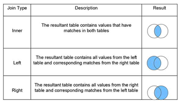
7. What are joins in SQL?
A JOIN clause is used to combine rows from two or more tables, based on a related column between them. It is used to merge two tables or retrieve data from there. There are 4 types of joins, as you can refer to below:
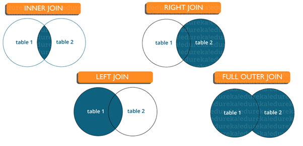
Inner join: Inner Join in SQL is the most common type of join. It is used to return all the rows from multiple tables where the join condition is satisfied.
Left Join: Left Join in SQL is used to return all the rows from the left table but only the matching rows from the right table where the join condition is fulfilled.
Right Join: Right Join in SQL is used to return all the rows from the right table but only the matching rows from the left table where the join condition is fulfilled.
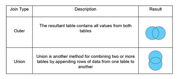
Full Join: Full join returns all the records when there is a match in any of the tables. Therefore, it returns all the rows from the left-hand side table and all the rows from the right-hand side table.
8. What is a Database?
Database is nothing but an organized form of data for easy access, storing, retrieval and managing of data. This is also known as structured form of data which can be accessed in many ways.
Example: School Management Database, Bank Management Database.
9. What is a primary key?
A primary key is a combination of fields which uniquely specify a row. This is a special kind of unique key, and it has implicit NOT NULL constraint. It means, Primary key values cannot be NULL.
10. What is a unique key?
A Unique key constraint uniquely identified each record in the database. This provides uniqueness for the column or set of columns.
A Primary key constraint has automatic unique constraint defined on it. But not, in the case of Unique Key.
There can be many unique constraint defined per table, but only one Primary key constraint defined per table.
11. What is a foreign key?
A foreign key is one table which can be related to the primary key of another table. Relationship needs to be created between two tables by referencing foreign key with the primary key of another table.
12. What is a Self-Join?
A self JOIN is a case of regular join where a table is joined to itself based on some relation between its own column(s). Self-join uses the INNER JOIN or LEFT JOIN clause and a table alias is used to assign different names to the table within the query.
SELECT A.emp_id AS "Emp_ID",A.emp_name AS "Employee",
B.emp_id AS "Sup_ID",B.emp_name AS "Supervisor"
FROM employee A, employee B
WHERE A.emp_sup = B.emp_id;13. What is a Cross-Join?
Cross join can be defined as a cartesian product of the two tables included in the join. The table after join contains the same number of rows as in the cross-product of number of rows in the two tables. If a WHERE clause is used in cross join then the query will work like an INNER JOIN.
SELECT stu.name, sub.subject
FROM students AS stu
CROSS JOIN subjects AS sub;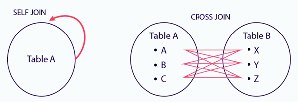
14. What is the difference between CHAR and VARCHAR2 datatype in SQL?
Both Char and Varchar2 are used for characters datatype but varchar2 is used for character strings of variable length whereas Char is used for strings of fixed length. For example, char(10) can only store 10 characters and will not be able to store a string of any other length whereas varchar2(10) can store any length i.e 6,8,2 in this variable.
15. What are Constraints?
Constraints in SQL are used to specify the limit on the data type of the table. It can be specified while creating or altering the table statement. The sample of constraints are:
- NOT NULL
- CHECK
- DEFAULT
- UNIQUE
- PRIMARY KEY
- FOREIGN KEY
16. What is the difference between DELETE and TRUNCATE statements?
| DELETE | TRUNCATE |
| Delete command is used to delete a row in a table. | Truncate is used to delete all the rows from a table. |
| You can rollback data after using delete statement. | You cannot rollback data. |
| It is a DML command. | It is a DDL command. |
| It is slower than truncate statement. | It is faster. |
17. What do you mean by data integrity?
Data Integrity defines the accuracy as well as the consistency of the data stored in a database. It also defines integrity constraints to enforce business rules on the data when it is entered into an application or a database.
18. What is an Index?
An Index in a relational database is a data structure that improves the speed of data retrieval operations on a table. Indexes allow the database to find and retrieve specific rows much faster than scanning the entire table.
Key Features of an Index:
- Improves Query Performance: Indexes reduce the time it takes to perform SELECT queries and JOIN operations by allowing the database to quickly locate the data.
- Created on Columns: Indexes are typically created on one or more columns of a table. These columns are often the ones most frequently searched or used in WHERE clauses.
- Supports Uniqueness: Some indexes, like the primary key index, enforce the uniqueness of values in a column.
Types of Indexes:
Primary Index:
- Automatically created when a primary key is defined.
- Enforces uniqueness and is used to speed up data access.
Unique Index:
- Ensures that no duplicate values are allowed in the indexed column.
- Similar to a primary index but can be applied to non-primary key columns.
Clustered Index:
- Determines the physical order of data in a table. The table itself is organized based on this index.
- Only one clustered index is allowed per table because the data rows can only be sorted in one way.
Non-Clustered Index:
- Does not alter the physical order of the data. Instead, it creates a separate structure (like a lookup table) that references the data.
- A table can have multiple non-clustered indexes.
Composite Index:
- An index on multiple columns. It is useful when queries involve conditions on more than one column.
Full-Text Index:
- Used for searching large text-based columns (like documents, descriptions).
- Supports advanced searching capabilities like searching for keywords, phrases, and proximity searches.
Bitmap Index:
- Typically used in data warehousing environments.
- Efficient for columns with low cardinality (few distinct values).
How Indexes Work:
Indexes function like a book’s index, allowing quick lookups by pointing directly to where the data is located. For example, if you have an index on the customer_name column, searching for a specific name doesn’t require scanning the entire table row by row; instead, the index is consulted to find the relevant rows directly.
Drawbacks of Indexes:
- Storage Overhead: Indexes require additional disk space.
- Slower Write Operations: Insert, update, and delete operations become slower because indexes need to be updated when the data changes.
- Maintenance: Indexes require maintenance and tuning to ensure optimal performance as the data grows.
Example of Creating an Index:
CREATE INDEX idx_customer_name ON customers(customer_name);This creates a non-clustered index on the customer_name column of the customers table.
When to Use Indexes:
- When a column is frequently used in WHERE clauses.
- When a column is frequently used in JOIN operations.
- When you need to enforce uniqueness (unique indexes).
- For speeding up queries on large tables.
Conclusion:
Indexes are powerful tools to optimize query performance, but they need to be used strategically to balance query speed with write performance and storage considerations.
19. Explain different types of index in SQL.
There are three types of index in SQL namely:
Unique Index:
This index does not allow the field to have duplicate values if the column is unique indexed. If a primary key is defined, a unique index can be applied automatically.
CREATE UNIQUE INDEX myIndex
ON students (enroll_no);
Clustered Index:
This index reorders the physical order of the table and searches based on the basis of key values. Each table can only have one clustered index.
Non-Clustered Index:
Non-Clustered Index does not alter the physical order of the table and maintains a logical order of the data. Each table can have many non clustered indexes.
20. What is a Data Definition Language?
Data definition language (DDL) is the subset of the database which defines the data structure of the database in the initial stage when the database is about to be created. It consists of the following commands: CREATE, ALTER and DELETE database objects such as schema, tables, view, sequence, etc.
21. What is a Data Manipulation Language?
Data manipulation language makes the user able to retrieve and manipulate data. It is used to perform the following operations.
- Insert data into database through INSERT command.
- Retrieve data from the database through SELECT command.
- Update data in the database through UPDATE command.
- Delete data from the database through DELETE command.
22. What is Data Control Language?
Data control language allows you to control access to the database. DCL is the only subset of the database which decides that what part of the database should be accessed by which user at what point of time. It includes two commands GRANT and REVOKE.
GRANT: to grant the specific user to perform a particular task
REVOKE: to cancel previously denied or granted permissions.
23. What is Normalization in SQL?
Normalization in SQL is a process of organizing the data in a database to reduce redundancy and improve data integrity. The main goal of normalization is to divide large tables into smaller, more manageable ones while defining relationships between them, ensuring that each piece of data is stored in one place only.
Key Objectives of Normalization:
- Eliminate Redundant Data: Ensure that no unnecessary duplicate data is stored.
- Ensure Data Integrity: Reduce the chances of anomalies like update, insert, and delete anomalies.
- Efficient Data Management: Normalize tables to streamline data management and reduce complexity.
Normal Forms:
Normalization is typically carried out in steps, referred to as “normal forms,” with each form addressing specific issues:
- First Normal Form (1NF):
- Ensures that all columns contain atomic (indivisible) values.
- Each column must have a unique name.
- All entries in a column must be of the same data type.
- Second Normal Form (2NF):
- Achieves 1NF.
- Ensures that all non-key attributes are fully dependent on the primary key. This eliminates partial dependencies, where an attribute depends only on part of a composite key.
- Third Normal Form (3NF):
- Achieves 2NF.
- Removes transitive dependencies, where non-key attributes depend on other non-key attributes.
- Boyce-Codd Normal Form (BCNF):
- A stricter version of 3NF, ensuring that every determinant is a candidate key.
- Fourth Normal Form (4NF) and Fifth Normal Form (5NF):
- These deal with more complex situations involving multi-valued dependencies and join dependencies, respectively.
Example:
Consider a table storing information about students and courses:
| StudentID | StudentName | CourseID | CourseName |
|---|---|---|---|
| 1 | Alice | 101 | Math |
| 1 | Alice | 102 | Physics |
| 2 | Bob | 101 | Math |
Here, student information is repeated if they are enrolled in multiple courses. By normalizing:
- Split into separate tables:
- Students Table: (StudentID, StudentName)
- Courses Table: (CourseID, CourseName)
- Enrollments Table: (StudentID, CourseID)
This structure removes redundancy and reduces anomalies.
In summary, normalization is crucial for creating efficient and scalable databases.
24. What is pl sql?
PL SQL stands for Procedural language constructs for Structured Query Language. PL SQL was introduced by Oracle to overcome the limitations of plain sql. So, pl sql adds in procedural language approach to the plain vanilla sql.
While, with the help of sql, we were able to DDL and DML queries, with the help of PL SQL, we will be able to create functions, triggers and other procedural constructs.
25. What is ETL in SQL?
ETL stands for Extract, Transform and Load. It is a three step process, where we would have to start off by extracting the data from sources. Once we collate the data from different sources, what we have is raw data. This raw data has to be transformed into tidy format, which will come in the second phase. Finally, we would have to load this tidy data into tools which would help us to find insights.
26. What is OLAP?
OLAP stands for Online Analytical Processing. And a class of software programs which are characterized by relatively low frequency of online transactions. Queries are often too complex and involve a bunch of aggregations.
27. What is a “TRIGGER” in SQL?
- A trigger allows you to execute a batch of SQL code when an insert, update or delete command is run against a specific table as TRIGGER is said to be the set of actions that are performed whenever commands like insert, update or delete are given through queries.
- The trigger is said to be activated when these commands are given to the system.
- Triggers are the particular type of stored procedures that are defined to execute automatically in place or after data modifications.
- Triggers are generated using CREATE TRIGGER statement.
28. What is ACID property in a database?
ACID property is used to ensure that the data transactions are processed reliably in a database system.
A single logical operation of a data is called transaction.
ACID is an acronym for Atomicity, Consistency, Isolation, Durability.
Atomicity: it requires that each transaction is all or nothing. It means if one part of the transaction fails, the entire transaction fails and the database state is left unchanged.
Consistency: the consistency property ensure that the data must meet all validation rules. In simple words you can say that your transaction never leaves your database without completing its state.
Isolation: this property ensure that the concurrent property of execution should not be met. The main goal of providing isolation is concurrency control.
Durability: durability simply means that once a transaction has been committed, it will remain so, come what may even power loss, crashes or errors.
29. What are the syntax and use of the COALESCE function?
The syntax of COALESCE function:
COALESCE(exp1, exp2, …. expn)
The COALESCE function is used to return the first non-null expression given in the parameter list.
30. What is the SQL query to display the current date?
There is a built-in function in SQL called GetDate() which is used to return the current timestamp.
31. Are NULL values same as that of zero or a blank space?
A NULL value is not at all same as that of zero or a blank space. NULL value represents a value which is unavailable, unknown, assigned or not applicable whereas a zero is a number and blank space is a character.
32. What is subquery in SQL?
A subquery is a query inside another query where a query is defined to retrieve data or information back from the database. In a subquery, the outer query is called as the main query whereas the inner query is called subquery. Subqueries are always executed first and the result of the subquery is passed on to the main query. It can be nested inside a SELECT, UPDATE or any other query. A subquery can also use any comparison operators such as >,< or =.
33. What is the difference between ‘HAVING’ CLAUSE and a ‘WHERE’ CLAUSE?
HAVING clause can be used only with SELECT statement. It is usually used in a GROUP BY clause and whenever GROUP BY is not used, HAVING behaves like a WHERE clause.
Having Clause is only used with the GROUP BY function in a query whereas WHERE Clause is applied to each row before they are a part of the GROUP BY function in a query.
34. How can you fetch first 5 characters of the string?
There are a lot of ways to fetch characters from a string. For example:
Select SUBSTRING(StudentName,1,5) as studentname from student.
35. What is a View?
A view is a virtual table which consists of a subset of data contained in a table. Since views are not present, it takes less space to store. View can have data of one or more tables combined and it depends on the relationship.
36. What are Views used for?
A view refers to a logical snapshot based on a table or another view. It is used for the following reasons:
- Restricting access to data.
- Making complex queries simple.
- Ensuring data independence.
- Providing different views of same data.
37. What is a Stored Procedure?
A Stored Procedure is a function which consists of many SQL statements to access the database system. Several SQL statements are consolidated into a stored procedure and execute them whenever and wherever required which saves time and avoid writing code again and again.
38. List some advantages and disadvantages of Stored Procedure?
Advantages:
A Stored Procedure can be used as a modular programming which means create once, store and call for several times whenever it is required. This supports faster execution. It also reduces network traffic and provides better security to the data.
Disadvantage:
The only disadvantage of Stored Procedure is that it can be executed only in the database and utilizes more memory in the database server.
39. What is Auto Increment in SQL?
Autoincrement keyword allows the user to create a unique number to get generated whenever a new record is inserted into the table.
This keyword is usually required whenever PRIMARY KEY in SQL is used.
40. What is a Datawarehouse?
A Data Warehouse (DW) is a centralized repository designed to store large volumes of structured data from multiple sources for analysis and reporting. It is primarily used in Business Intelligence (BI) to help organizations make informed decisions based on historical and current data.
Key Characteristics of a Data Warehouse:
- Subject-Oriented: Organized around major business areas such as sales, finance, or marketing, making it easier to analyze data relevant to a specific business function.
- Integrated: Combines data from different sources (databases, flat files, ERP systems) into a consistent format with a common data model.
- Time-Variant: Stores historical data over long periods, allowing for trend analysis and comparison across time.
- Non-Volatile: Once data is entered into the warehouse, it is rarely changed or deleted, ensuring stable and reliable data for analysis.
Architecture of a Data Warehouse:
- Data Sources: Raw data comes from various sources like transactional databases, CRM systems, and external sources.
- ETL Process (Extract, Transform, Load):
- Extract: Collect data from different sources.
- Transform: Clean, format, and standardize the data.
- Load: Store the transformed data into the data warehouse.
- Data Storage: Data is typically organized into:
- Staging Area: Temporary storage where data is cleaned and processed.
- Data Warehouse Layer: The main storage layer optimized for query performance.
- Data Marts: Subsets of the data warehouse designed for specific departments or business functions.
- Presentation/BI Layer: Tools and dashboards that allow users to access, analyze, and visualize the data, generating reports, insights, and dashboards.
Benefits of a Data Warehouse:
- Enhanced Decision-Making: Provides a unified view of data for better insights and strategic decisions.
- Improved Data Quality and Consistency: Standardized data formats reduce inconsistencies.
- Historical Analysis: Supports trend analysis, forecasting, and business intelligence by storing years of historical data.
- Faster Query Performance: Optimized for complex queries and analytics rather than day-to-day transactional operations.
Example Use Case:
A retail company can use a data warehouse to analyze sales data across different regions, time periods, and products. By integrating data from various sources (e.g., sales systems, inventory systems), they can track trends, optimize stock levels, and make data-driven marketing decisions.
In summary, a data warehouse is the backbone of an organization’s data infrastructure, enabling large-scale data analysis and driving business intelligence.
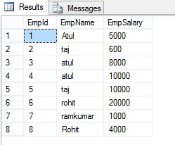
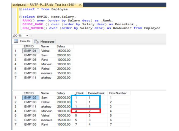
41. What is RANK, DANCE_RANK and ROW_NUMBER Functions?
Lets understand all terms with following example:
Here I have an Employe table, the following is the sample data for the Employe Table.
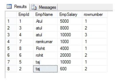
ROW_NUMBER() Function with Partition By clause:
The ROW_NUMBER() function assigns a unique sequential integer to rows within a partition of a result set. The numbering starts at 1 for the first row in each partition and increases by 1 for each subsequent row.
Syntax
ROW_NUMBER () OVER ([PARTITION BY value_exp, … [ n ]] ORDER BY_clause)
If we want to add row number to each group, partition by help to reset for every group, let’s take a look at the Employe table.
Select *, ROW_NUMBER() over(partition by Empname order by Empname ) as rownumber from EmployeeThe following is the OUTPUT of the above query
Rank() Function in SQL Server:
The RANK() function assigns a rank to rows based on the ordering of a specified column. Rows with the same value receive the same rank, and gaps are left in the ranking sequence for ties.
SELECT EmpName, EmpSalary ,rank() over(order by EmpName) as rankID from Employe;The following is the OUTPUT of the above query.
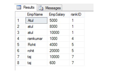
Gap represents number of occurrence example – EmpName=”atul” is repeated 3 times and has rank “1”, the next rank will be 1+3=4 and same with the next value.
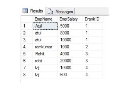
Dense_Rank() Function in SQL Server:
The DENSE_RANK() function works similarly to RANK(), but it does not leave gaps in the ranking sequence when there are ties.
SELECT EmpName ,EmpSalary ,DENSE_RANK() over(order by EmpName) as DrankID from Employee
The following is the OUTPUT of the above query:
Summery:
42. Explain Normalization and De-Normalization.
Normalization and Denormalization are two opposite approaches in database design that impact how data is structured and managed:
1. Normalization:
Normalization is the process of organizing data in a database into multiple related tables to minimize redundancy and improve data integrity. The goal is to divide large tables into smaller, more manageable tables and establish relationships between them.
Key Features:
- Reduces Data Redundancy: Data is broken down into multiple related tables to avoid duplication.
- Improves Data Integrity: Reduces the chances of update, insert, and delete anomalies.
- Follows Normal Forms: Data is structured according to various normal forms (1NF, 2NF, 3NF, etc.).
- Optimized for Write Operations: It’s well-suited for transactional databases (OLTP) where data updates, inserts, and deletes are frequent.
Example:
Instead of storing both customer details and order details in a single table, normalization would separate them into two tables:
- Customers Table: Contains customer information.
- Orders Table: Contains order information with a foreign key reference to the Customers table.
2. Denormalization:
Denormalization is the process of combining related tables into one larger table to reduce the number of joins and improve read performance. It intentionally introduces redundancy for faster query performance.
Key Features:
- Increases Redundancy: Some data is duplicated across tables, making reads faster.
- Simplifies Queries: Fewer joins are needed, leading to improved performance for complex queries.
- Optimized for Read Operations: It’s well-suited for analytical databases (OLAP) where read queries are frequent and need to be fast.
- Data Integrity Challenges: With redundancy, maintaining consistency across data updates can be challenging.
Example:
In a denormalized database, customer and order details might be combined into a single table, avoiding the need for a join operation when querying both customer and order information.
Comparison:
| Feature | Normalization | Denormalization |
|---|---|---|
| Purpose | Minimize redundancy and maintain data integrity | Improve read performance by reducing joins |
| Data Structure | Divides data into multiple smaller tables | Combines data into fewer, larger tables |
| Performance | Optimized for write operations (OLTP) | Optimized for read operations (OLAP) |
| Data Integrity | High, with reduced redundancy | Lower, with potential data inconsistency issues |
| Complexity | Requires complex queries with multiple joins | Simplifies queries, often with less complex joins |
| Use Case | Transactional systems (e.g., banking, retail applications) | Analytical systems (e.g., data warehouses, reporting) |
Conclusion:
- Normalization is used when data integrity and storage efficiency are priorities.
- Denormalization is used when read performance is crucial, often at the cost of redundancy and potential data inconsistency.
In practice, the decision between normalization and denormalization depends on the specific needs of the application, whether it is more read-intensive or write-intensive, and the performance requirements.
43. What is a deadlock?
It is an unwanted situation where two or more transactions are waiting indefinitely for one another to release the locks.
44. What is ALIAS command?
This command provides another name to a table or a column. It can be used in WHERE clause of a SQL query using the “as” keyword.
45. What is the difference between Datawarehouse, Data lake and lake house?
Here’s a comparison of a Data Warehouse, Data Lake, and Lakehouse:
| Feature | Data Warehouse | Data Lake | Lakehouse |
|---|---|---|---|
| Purpose | Structured data storage for reporting and analysis. | Store raw, unstructured, and semi-structured data. | Combines features of both data warehouses and data lakes. |
| Data Type | Structured and relational data. | Structured, semi-structured, and unstructured data. | Supports structured, semi-structured, and unstructured data. |
| Schema | Schema-on-write (pre-defined schema). | Schema-on-read (define schema when querying). | Flexible schema handling (supports both schema-on-write and schema-on-read). |
| Data Storage Format | Optimized for tables and relational databases (e.g., SQL). | Raw files in various formats (e.g., JSON, XML, Parquet). | Stores data in formats like Parquet and Delta Lake with ACID properties. |
| Use Case | BI, reporting, and historical analysis on structured data. | Big data analytics, data science, and exploratory analysis. | Unified approach for BI, ML, and streaming analytics. |
| Processing Engine | SQL-based processing (traditional OLAP). | Supports multiple engines (e.g., Hadoop, Spark). | Supports SQL, ML, and streaming engines in a unified platform. |
| Data Governance | High control, with strict governance and data quality. | Lower governance, flexible but with potential inconsistencies. | Offers better governance and data quality control similar to data warehouses. |
| Performance | High performance for structured queries and reports. | May require optimization for specific queries. | Optimized for both SQL analytics and large-scale data processing. |
| Scalability | Scales well for structured data but can be expensive. | Highly scalable for any type of data, often cost-efficient. | Scales efficiently, combining the benefits of both approaches. |
| Cost | Can be expensive due to compute and storage needs. | Typically lower-cost storage, but processing can add cost. | Cost-effective, combining cloud storage with optimized compute. |
| Examples | Amazon Redshift, Snowflake, Google BigQuery. | Amazon S3, Azure Data Lake, Hadoop HDFS. | Databricks Lakehouse, Delta Lake, Google BigLake. |
Summary:
- Data Warehouses are best for structured data and traditional analytics.
- Data Lakes are ideal for storing vast amounts of raw data for big data analytics and data science.
- Lakehouses combine the strengths of both, offering a unified platform for various data types, supporting both traditional BI and advanced analytics.
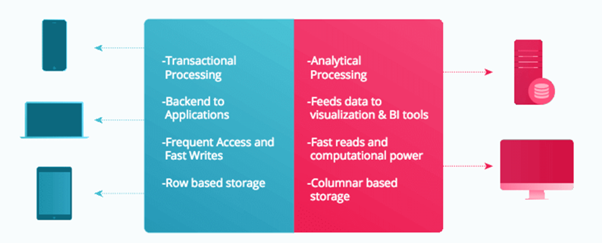
46. What is OLTP?
OLTP stands for Online Transaction Processing, is a class of software applications capable of supporting transaction-oriented programs. An essential attribute of an OLTP system is its ability to maintain concurrency. To avoid single points of failure, OLTP systems are often decentralized. These systems are usually designed for a large number of users who conduct short transactions. Database queries are usually simple, require sub-second response times and return relatively few records. Here is an insight into the working of an OLTP system.
47. What are the differences between OLTP and OLAP?
OLTP stands for Online Transaction Processing, is a class of software applications capable of supporting transaction-oriented programs. An important attribute of an OLTP system is its ability to maintain concurrency. OLTP systems often follow a decentralized architecture to avoid single points of failure. These systems are generally designed for a large audience of end users who conduct short transactions. Queries involved in such databases are generally simple, need fast response times and return relatively few records. Number of transactions per second acts as an effective measure for such systems.
OLAP stands for Online Analytical Processing, a class of software programs which are characterized by relatively low frequency of online transactions. Queries are often too complex and involve a bunch of aggregations. For OLAP systems, the effectiveness measure relies highly on response time. Such systems are widely used for data mining or maintaining aggregated, historical data, usually in multi-dimensional schemas.
48. What are the different Keys in relational Database?
In a relational database, various types of keys help define relationships, enforce integrity, and ensure data uniqueness. Here are the most commonly used keys:
| Key Type | Description |
|---|---|
| Primary Key | A unique identifier for each record in a table. It cannot contain NULL values. |
| Candidate Key | A set of attributes that can uniquely identify a record. The primary key is selected from candidate keys. |
| Super Key | A set of one or more attributes that can uniquely identify a record, possibly including extra attributes that are not needed for uniqueness. |
| Composite Key | A primary key consisting of more than one attribute (column). Used when no single attribute can uniquely identify records. |
| Foreign Key | An attribute or a set of attributes in one table that refers to the primary key of another table, establishing a relationship between tables. |
| Unique Key | Ensures all values in a column or set of columns are unique. Unlike the primary key, it can contain NULL values. |
| Alternate Key | A candidate key that is not chosen as the primary key. Also known as a secondary key. |
| Surrogate Key | An artificially generated key, usually a numeric value like an auto-incremented ID, used as a unique identifier. It has no business meaning and is only used internally. |
| Composite Foreign Key | A foreign key that consists of multiple columns, matching a composite primary key in another table. |
| Natural Key | A key that has a business meaning and is naturally present in the data (e.g., a Social Security Number or email address). |
Key Definitions in Detail:
- Primary Key: Uniquely identifies each record in a table. A table can have only one primary key, which cannot have NULL values.
- Candidate Key: A set of attributes that can uniquely identify records. A table can have multiple candidate keys, but one of them becomes the primary key.
- Super Key: A combination of attributes that can uniquely identify records. Super keys can have extra, non-essential attributes.
- Composite Key: A key made up of two or more attributes to uniquely identify records.
- Foreign Key: A key used to link two tables, referencing the primary key in another table. It establishes referential integrity.
- Unique Key: Ensures uniqueness across rows in a column. It can have NULL values but ensures that all non-NULL values are unique.
- Alternate Key: A candidate key that was not selected as the primary key.
- Surrogate Key: An automatically generated unique key, often used in place of a natural key.
- Natural Key: A key that naturally exists in the data and has business relevance.
These keys play crucial roles in defining relationships, maintaining data integrity, and optimizing database performance.
49. What is LEAD and LAG function
The LEAD and LAG functions are analytic functions in SQL that allow you to access data from preceding or following rows within the same result set, without the need for self-joins. They are commonly used in data analysis for time-series data, rankings, and trends.
1. LAG Function:
The LAG function provides access to a value from a previous row (before the current row) in the same result set.
Syntax:
LAG(column_name, offset, default_value) OVER (PARTITION BY partition_column ORDER BY order_column)- column_name: The column from which you want to get the previous value.
- offset: The number of rows back from the current row. The default is 1.
- default_value: The value to return if there is no previous row (optional).
- PARTITION BY: Divides the result set into partitions and applies the function within each partition.
- ORDER BY: Determines the order of the rows within each partition.
Example:
Suppose you have a sales table with sales_id, sales_date, and amount. You want to see the previous day’s sales amount for each row.
SELECT
    sales_id,
    sales_date,
    amount,
    LAG(amount, 1, 0) OVER (ORDER BY sales_date) AS previous_day_amount
FROM
    sales;
This will show the amount from the previous day (row) next to the current day.
2. LEAD Function:
The LEAD function provides access to a value from the next row (after the current row) in the same result set.
Syntax:
LEAD(column_name, offset, default_value) OVER (PARTITION BY partition_column ORDER BY order_column)- column_name: The column from which you want to get the next value.
- offset: The number of rows forward from the current row. The default is 1.
- default_value: The value to return if there is no next row (optional).
- PARTITION BY: Divides the result set into partitions and applies the function within each partition.
- ORDER BY: Determines the order of the rows within each partition.
Example:
Using the same sales table, you want to see the next day’s sales amount for each row.
SELECT
    sales_id,
    sales_date,
    amount,
    LEAD(amount, 1, 0) OVER (ORDER BY sales_date) AS next_day_amount
FROM
    sales;
This will show the amount for the next day (row) next to the current day.
Use Cases:
- LAG is useful for comparing a value with the previous period (e.g., sales growth compared to the previous month).
- LEAD is useful for forecasting or seeing future trends (e.g., comparing current sales with next month’s expected sales).
Comparison Between LAG and LEAD:
- LAG: Looks at the previous row.
- LEAD: Looks at the next row.
Both functions are powerful tools in time-series analysis, trend detection, and data comparisons within partitions.
50. What is Left outer Join and Right Outer Join?
In SQL, LEFT OUTER JOIN and RIGHT OUTER JOIN are used to combine rows from two or more tables based on a related column between them. The key difference lies in how they handle rows that do not have matching data in both tables.
1. LEFT OUTER JOIN:
A LEFT OUTER JOIN (or simply LEFT JOIN) returns all records from the left table (Table A), and the matched records from the right table (Table B). If there is no match, NULL values are returned for columns from the right table.
Syntax:
SELECT columns
FROM table_A
LEFT OUTER JOIN table_B
ON table_A.column = table_B.column;
Behavior:
- Includes all rows from the left table.
- If there is no match in the right table, NULL values are displayed for columns from the right table.
Example:
Imagine you have two tables:
Customers Table (left table):
| CustomerID | CustomerName |
|---|---|
| 1 | Alice |
| 2 | Bob |
| 3 | Charlie |
Orders Table (right table):
| OrderID | CustomerID | OrderDate |
|---|---|---|
| 101 | 1 | 2024-08-01 |
| 102 | 2 | 2024-08-03 |
Query:
SELECT Customers.CustomerID, Customers.CustomerName, Orders.OrderDate
FROM Customers
LEFT OUTER JOIN Orders
ON Customers.CustomerID = Orders.CustomerID;
Result:
| CustomerID | CustomerName | OrderDate |
|---|---|---|
| 1 | Alice | 2024-08-01 |
| 2 | Bob | 2024-08-03 |
| 3 | Charlie | NULL |
Here, Charlie has no matching order, so the OrderDate is NULL.
2. RIGHT OUTER JOIN:
A RIGHT OUTER JOIN (or simply RIGHT JOIN) returns all records from the right table (Table B), and the matched records from the left table (Table A). If there is no match, NULL values are returned for columns from the left table.
Syntax:
SELECT columns
FROM table_A
RIGHT OUTER JOIN table_B
ON table_A.column = table_B.column;
Behavior:
- Includes all rows from the right table.
- If there is no match in the left table, NULL values are displayed for columns from the left table.
Example:
Using the same Customers and Orders tables:
Query:
SELECT Customers.CustomerID, Customers.CustomerName, Orders.OrderDate
FROM Customers
RIGHT OUTER JOIN Orders
ON Customers.CustomerID = Orders.CustomerID;
Result:
| CustomerID | CustomerName | OrderDate |
|---|---|---|
| 1 | Alice | 2024-08-01 |
| 2 | Bob | 2024-08-03 |
| NULL | NULL | 2024-08-05 |
In this case, if there were an order in the Orders table that did not have a matching customer in the Customers table, it would still appear, with NULL values for CustomerID and CustomerName.
Key Differences:
| Aspect | LEFT OUTER JOIN | RIGHT OUTER JOIN |
|---|---|---|
| Primary Table | All rows from the left table (Table A) are included. | All rows from the right table (Table B) are included. |
| Matching Rows | Includes matching rows from the right table. | Includes matching rows from the left table. |
| Unmatched Rows | Unmatched rows from the left table appear with NULLs. | Unmatched rows from the right table appear with NULLs. |
Conclusion:
- Use LEFT JOIN when you want to retain all rows from the left table.
- Use RIGHT JOIN when you want to retain all rows from the right table.
These joins are useful in different scenarios depending on which table’s data you prioritize.
Reference:-
https://www.mygreatlearning.com
https://www.edureka.co