When we have a dataset with multiple input features, we know the model will overfit. To reduce input feature space, we can either drop or extract features, this is basically a dimension reduction.
Now let’s discuss more about both techniques.
Drop irrelevant, redundant features as they do not contribute to the accuracy of the predictive problem. When we drop such input variable, we lose information stored in these variables.
We can create a new independent variable from existing input variables. This way we do not lose the information in the variables. This is feature extraction
2. Explain Principal Component Analysis?
When we have a large dataset of correlated input variables and we want to reduce the number of input variables to a smaller feature space. while doing this we still want to maintain the critical information. We can solve this by using Principal Component Analysis-PCA.
Now let’s understand the PCA features in little bit more details.
PCA reduce dimensionality of the data using feature extraction. It does this by using variables that help explain most variability of the data in the dataset.
PCA removes redundant information by removing correlated features. PCA creates new independent variables that are independent from each other. This takes care of multicollinearity issue.
PCA is an unsupervised technique. It only looks at the input features and does not take into account the output or the target variable.
3. Importance and limitation of Principal Component Analysis?
Following are the advantages of PCA
Removes Correlated Features – To visualize our all features in data, we must reduce the same in data, to do that we need to find out the correlation among the features (correlated variables). Finding correlation manually in thousands of features is nearly impossible, frustrating and time-consuming. PCA does this for you efficiently.
Improve algorithm performance – With so many features, the performance of your algorithm will drastically degrade. PCA is a very common way to speed up your Machine Learning algorithm by getting rid of correlated variables which don’t contribute in any decision making.
Improve Visualization – It is very hard to visualize and understand the data in high dimensions. PCA transforms a high dimensional data to low dimensional data (2 dimension) so that it can be visualized easily.
Following are the limitation of PCA
Independent variable become less interpretable – After implementing PCA on the dataset, your original features will turn into Principal Components. Principal Components are the linear combination of your original features. Principal Components are not as readable and interpretable as original features.
Data standardization is must before PCA – You must standardize your data before implementing PCA, otherwise PCA will not be able to find the optimal Principal Components.
Information loss – Although Principal Components try to cover maximum variance among the features in a dataset, if we don’t select the number of Principal Components with care, it may miss some information as compared to the original list of features.
4. What is t-SNE and How to apply t-SNE ?
t-Distributed Stochastic Neighbor Embedding (t-SNE) is an unsupervised, non-linear technique primarily used for data exploration and visualizing high-dimensional data. In simpler terms, t-SNE gives you a feel or intuition of how the data is arranged in a high-dimensional space.
Let’s understand each and every term in details.
Scholastic – Not definite but random probability Neighbourhood – Concerned only about retaining the structure of neighbourhood points. Embedding – It means picking up a point from high dimensional space and placing it into lower dimension
5. How to apply t-SNE ?
Basically, it measure similarities between points in the high dimensional space.
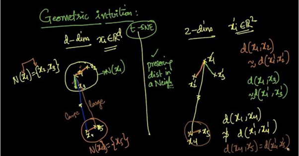
Let’s see below image and try to understand the algorithm.
t-SNE example
Suppose we are reducing d-dimensional data into 2-dimensional data using t-SNE. From the above picture we can see that x2 and x3 are in the neighborhood of x1 [N(x1) = {x2, x3}] and x5 is in the neighborhood of x4 [N(x4) = {x5}].
As t-SNE preserves the distances in a neighborhood,
For every point, it constructs a notion of which other points are its ‘neighbors,’ trying to make all points have the same number of neighbors. Then it tries to embed them so that those points all have the same number of neighbors.
6. What is Crowding problem?
Sometimes it is impossible to preserve the distances in all the neighbourhoods. This problem is called Crowding Problem or When we model a high-dimensional dataset in 2 (or 3) dimensions, it is difficult to segregate the nearby datapoints from moderately distant datapoints and gaps can not form between natural clusters.
For example, when a data point, ‘x’ is a neighbor to 2 data points that are not neighboring to each other, this may result in losing the neighborhood of ‘x’ with one of the data points as t-SNE is concerned only within the neighborhood zone.
7. How to interpret t-SNE output?
There are 3 parameters a) Steps: number of iterations. b) Perplexity: can be thought of as the number of neighboring points. c) Epsilon: It is for data visualization and determines the speed which it should be changed.
How do you assess the statistical significance of an insight?
We need to perform
hypothesis testing to determine statistical significance. Will take following
steps.
First will define null hypothesis and alternate hypothesis
We will calculate p- value
Last, we would set the level of the significance (alpha) and if the p-value is less than the alpha, you would reject the null — in other words, the result is statistically significant.
What is the Central Limit Theorem and why is it important?
Central limit
theorem is very important concept in stats. It states that no matter the
underlying distribution of the data set, the sampling distribution would be equal
to the mean of original distribution and variance would be n times smaller,
where n is the size of sample
The central limit
theorem (CLT) states that the distribution of sample means approximates a
normal distribution as the sample size gets larger.
Sample sizes equal
to or greater than 30 are considered sufficient for the CLT to hold.
A key aspect of CLT
is that the average of the sample means and standard deviations will equal the
population mean and standard deviation.
Example-
Suppose that we are interested in estimating the average height among all people. Collecting data for every person in the world is impossible. While we can’t obtain a height measurement from everyone in the population, we can still sample some people. The question now becomes, what can we say about the average height of the entire population given a single sample. The Central Limit Theorem addresses this question exactly.”
What is sampling? How many sampling methods do you know?
Data sampling is a statistical analysis technique used to select, manipulate and analyse a subset of data points to identify patterns and trends in the larger data set. It enables data scientists and other data analysts to work with a small, manageable amount of data about a statistical population to build and run analytical models more quickly, while still producing accurate findings.
Simple random sampling: Software is used to randomly select subjects from the whole population.
Stratified sampling: Subsets of the data sets or population are created based on a common factor, and samples are randomly collected from each subgroup.
Cluster sampling: The larger data set is divided into subsets (clusters) based on a defined factor, then a random sampling of clusters is analyzed.
Multistage sampling: A more complicated form of cluster sampling, this method also involves dividing the larger population into a number of clusters. Second-stage clusters are then broken out based on a secondary factor, and those clusters are then sampled and analyzed. This staging could continue as multiple subsets are identified, clustered and analyzed.
Systematic sampling: A sample is created by setting an interval at which to extract data from the larger population — for example, selecting every 10th row in a spreadsheet of 200 items to create a sample size of 20 rows to analyze.
Explain selection bias (with regard to a dataset, not variable
selection). Why is it important? How can data management procedures such as
missing data handling make it worse?
Selection bias is the phenomenon of selecting individuals, groups or data for analysis
in such a way that proper randomization is not achieved, ultimately resulting
in a sample that is not representative of the population.
Types of selection bias include:
sampling bias: a biased
sample caused by non-random sampling
time interval: selecting
a specific time frame that supports the desired conclusion. e.g. conducting a
sales analysis near Christmas.
attrition: attrition bias is similar
to survivorship bias, where only those that ‘survived’ a long process are
included in an analysis, or failure bias, where those that ‘failed’ are only
included
observer selection: related
to the Anthropic principle, which is a philosophical consideration that any
data we collect about the universe is filtered by the fact that, in order for
it to be observable, it must be compatible with the conscious and sapient life
that observes it.
Handling missing data can make selection bias worse because different methods impact the data in different ways. For example, if you replace null values with the mean of the data, you adding bias in the sense that you’re assuming that the data is not as spread out as it might actually be.
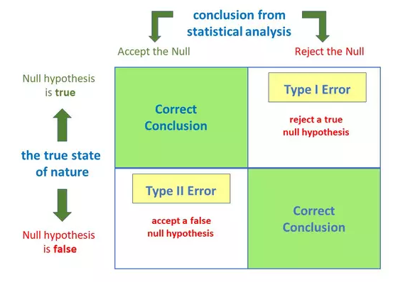
What is the difference
between type I vs type II error?
Anytime we make a decision using statistics there are four possible outcomes, with two representing correct decisions and two representing errors.
Type – I Error:
A
type 1 error is also known as a false positive and occurs when a researcher
incorrectly rejects a true null hypothesis. This means that your report that
your findings are significant when in fact they have occurred by chance.
The probability of making a type I error is represented by your alpha level (α), which is the p-value. A p-value of 0.05 indicates that you are willing to accept a 5% chance that you are wrong when you reject the null hypothesis
Type – II Error:
A
type II error is also known as a false negative and occurs when a researcher
fails to reject a null hypothesis which is really false. Here a researcher
concludes there is not a significant effect, when actually there really is.
The probability of making a type II error is called Beta (β), and this is related to the power of the statistical test (power = 1- β). You can decrease your risk of committing a type II error by ensuring your test has enough power.
What are the four
main things we should know before studying data analysis?
Following are the key point that we should know:
Descriptive statistics
Inferential statistics
Distributions (normal distribution / sampling
distribution)
Hypothesis testing
What is the difference between inferential statistics and descriptive statistics?
Descriptive Analysis – It uses the data to provide description of the
population either through numerical calculations or graph or tables.
Inferential statistics – Provides information of a sample and we need to inferential statistics to reach to a conclusion about the population.
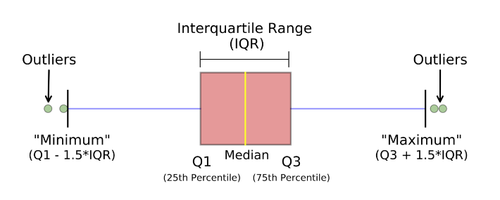
How to calculate
range and interquartile range?
IQR = Q3 – Q1
Where, Q3 is the third
quartile (75 percentile)
Where, Q1 is the first quartile (25 percentile)
What is the benefit
of using box plot?
A box plot, also known as a box and whisker plot, is a type of graph that displays a summary of a large amount of data in five numbers. These numbers include the median, upper quartile, lower quartile, minimum and maximum data values.
Following are the advantages of Box-plot:
Handle Large data easily – Due to the five-number data summary, a box plot
can handle and present a summary of a large amount of data. Organizing data in
a box plot by using five key concepts is an efficient way of dealing with large
data too unmanageable for other graphs, such as line plots or stem and leaf
plots.
A box plot shows only a simple summary
of the distribution of results, so that it you can quickly view it and compare
it with other data.
A box plot is a highly visually
effective way of viewing a clear summary of one or more sets of data.
A box plot is one of very few
statistical graph methods that show outliers. Any results of data that fall
outside of the minimum and maximum values known as outliers are easy to
determine on a box plot graph.
What is the meaning of standard deviation?
It represents
how far are the data points from the mean
(σ) = √(∑(x-µ)2 / n)
Variance is the square of standard deviation
What is left skewed
distribution and right skewed distribution?
Left skewed
The left
tail is longer than the right side
Mean <
median < mode
Right skewed
The right
tail is longer than the left side
Mode <
median < mean
What does symmetric distribution mean?
The part of the distribution
that is on the left side of the median is same as the part of the distribution
that is on the right side of the median
Few examples are – uniform distribution, binomial distribution, normal distribution
What is the relationship between mean and median in normal distribution?
In the normal distribution mean is equal to median
What does it mean by bell curve
distribution and Gaussian distribution?
Normal distribution is called bell curve distribution / Gaussian distribution.It is called bell curve because it has the shape of a bell.It is called Gaussian distribution as it is named after Carl Gauss.
How to convert normal distribution to standard normal distribution?
Standardized normal distribution
has mean = 0 and standard deviation = 1. To convert normal distribution to
standard normal distribution we can use the formula
X (standardized) = (x-µ) / σ
What is an outlier? What can I do
with outlier?
An
outlier is an abnormal value (It is at an abnormal distance from rest of the
data points).
Following thing we can do with outliers
Remove outlier
When we
know the data-point is wrong (negative age of a person)
When we
have lots of data
We should
provide two analyses. One with outliers and another without outliers.
Keep outlier
When
there are lot of outliers (skewed data)
When
results are critical
When
outliers have meaning (fraud data)
What is the difference between population parameters and sample statistics?
Population parameters are:
Mean = µ
Standard
deviation = σ
Sample statistics are:
Mean = x
(bar)
Standard
deviation = s
How to find the mean length of all fishes in the sea?
Define the confidence level (most common is 95%). Take a sample of fishes from the sea (to get better results the number of fishes > 30). Calculate the mean length and standard deviation of the lengths. Calculate t-statistics. Get the confidence interval in which the mean length of all the fishes should be.
What are the effects of the width of confidence interval?
Confidence interval is used for decision making
As the confidence level increases the width of the confidence interval also increases
As the width of the confidence interval increases, we tend to get useless information also.
Mention the relationship between standard error and margin of error?
As the standard error increases the margin of error also increases.
What is p-value and what does it signify?
The p-value reflects the strength of evidence against the null hypothesis. p-value is defined as the probability that the data would be at least as extreme as those observed, if the null hypothesis were true.
P- Value > 0.05 denotes weak evidence against the null hypothesis which means the null hypothesis cannot be rejected.
P-value < 0.05 denotes strong evidence against the null hypothesis which means the null hypothesis can be rejected.
P-value=0.05 is the marginal value indicating it is possible to go either way.
How to calculate p-value using manual method?
Find H0 and H1
Find n, x(bar) and s
Find DF for t-distribution
Find the type of distribution – t or z
distribution
Find t or z value (using the look-up table)
Compute the p-value to critical value
What is the difference between
one tail and two tail hypothesis testing?
Two tail test – When null hypothesis
contain an equality (=) or inequality sign (<>)
One tail test – When the null
hypothesis does not contain equality (=) or inequality sign (<, >, <=,
>= )
What is A/B testing?
A/B testing is a form of hypothesis testing and two-sample hypothesis testing to compare two versions, the control and variant, of a single variable. It is commonly used to improve and optimize user experience and marketing.
What is R-squared and Adjusted R-square?
R-squared or R2 is a value in which your input variables explain
the variation of your output / predicted variable. So, if R-square is 0.8, it
means 80% of the variation in the output variable is explained by the input
variables. So, in simple terms, higher the R squared, the more variation is
explained by your input variables and hence better is your model.
However, the problem with
R-squared is that it will either stay the same or increase with addition of
more variables, even if they do not have any relationship with the output
variables. This is where “Adjusted R square” comes to help. Adjusted R-square
penalizes you for adding variables which do not improve your existing model.
Hence, if you are building
Linear regression on multiple variable, it is always suggested that you use
Adjusted R-squared to judge goodness of model. In case you only have one input
variable, R-square and Adjusted R squared would be exactly same.
Typically, the more non-significant variables you add into the model, the gap in R-squared and Adjusted R-squared increases.
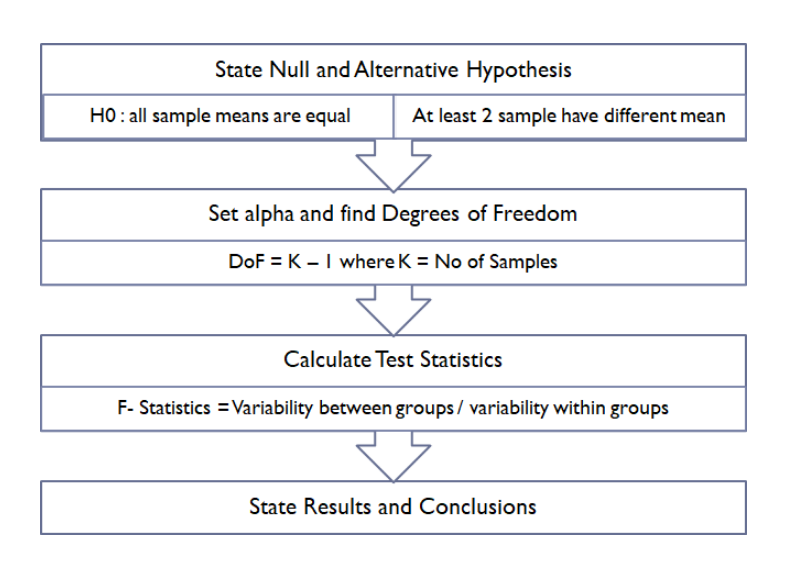
Explain ANOVA and it’s applications?
Analysis of Variance (abbreviated as ANOVA) is an extremely useful technique which is used to compare the means of multiple samples. Whether there is a significant difference between the mean of 2 samples, can be evaluated using z-test or t-test but in case of more than 2 samples, t-test can not be applied as it accumulates the error and it will be cumbersome as the number of sample will increase (for example: for 4 samples — 12 t-test will have to be performed). The ANOVA technique enables us to perform this simultaneous test. Here is the procedure to perform ANOVA.
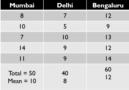
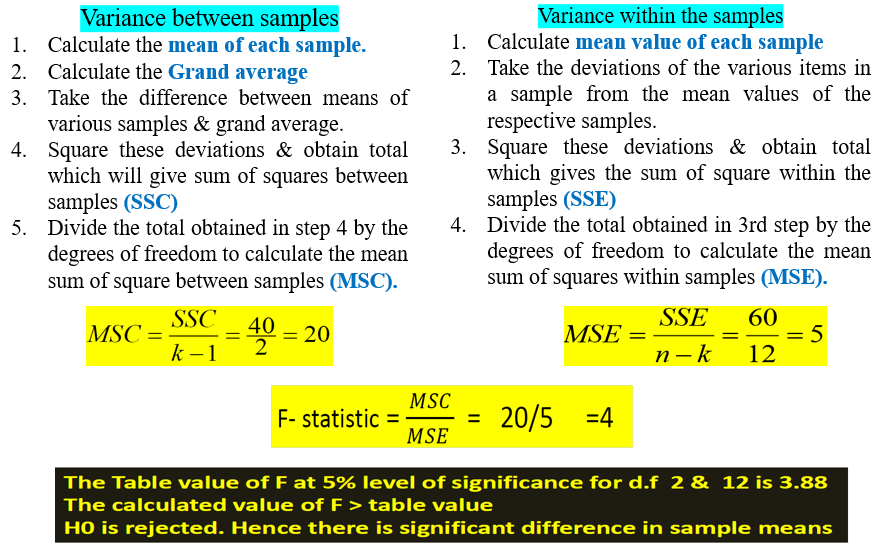
Let’s see with example: Imagine we want to compare the salary of Data Scientist across 3 cities of india — Bengaluru, Delhi and Mumbai. In order to do so, we collected data shown below.
Following picture explains the steps
followed to get the Anova results
There is a limitation of ANOVA that it does not tell which pair is having significant difference. In above example, It is clear that there is a significant difference between the means of Data Scientist salary among these 3 cities but it does not provide any information on which pair is having the significant difference
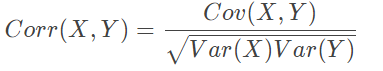
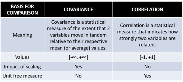
What is the difference between Correlation and Covariance?
Correlation and Covariance are statistical concepts which are generally used to determine the relationship and measure the dependency between two random variables. Actually, Correlation is a special case of covariance which can be observed when the variables are standardized. This point will become clear from the formulas :
Here listed key differences between covariance and correlation
Matplotlib is the “grandfather” library of data visualization with Python. It was created by John Hunter. He created it to try to replicate MatLab’s (another programming language) plotting capabilities in Python. So if you happen to be familiar with matlab, matplotlib will feel natural to you.
It is an excellent 2D and 3D graphics library for generating scientific figures.
Some of the major Pros of Matplotlib are:
Generally easy to get started for simple
plots
Support for custom labels and texts
Great control of every element in a
figure
High-quality output in many formats
Very customizable in general
Matplotlib allows you to create reproducible figures programmatically. Let’s learn how to use it! I encourage you just to explore the official Matplotlib web page: http://matplotlib.org/
Installation of Matplotlib:
To install the latest release of matplotlib, you can use pip:
pip install matplotlib
You can also use conda to install the latest version of matplotlib:
conda install matplotlib
Now from next lecture we will learn how to plot different kind of charts and plot with the help of matplotlib.
“If matplotlib “tries to make easy things easy and hard things possible”, seaborn tries to make a well-defined set of hard things easy too”
So we can say seaborn is an amazing python data visualization library built on top of the matplotlib.
Why one should you Seaborn instead of matplotlib?
Seaborn comes with a large number of high-level interfaces and customized themes where matplotlib lacks as it’s not easy to figure out the settings that makes plots attractive.
Matplotlib functions don’t work well with dataframes, whereas seaborn does.
Installation:
To install the latest release of seaborn, you can use pip.
pip install seaborn
You can also use conda to install the latest version of seaborn
Matrix plots allow you to plot data as color-encoded matrices and can also be used to indicate clusters within the data (later in the machine learning section we will learn how to formally cluster data).
So in this article we will deal with basically two plots as per follow:
Heatmaps:- A heat map (or heatmap) is a graphical representation of data where values are depicted by color. Heat maps make it easy to visualize complex data and understand it at a glance. To use a heatmap the data should be in a matrix form i.e the index name and the column name must match in some way so that the data that we fill inside the cells are relevant.
Cluster maps:- Cluster maps uses hierarchical clustering. It performs the clustering based on the similarity of the rows and columns.
Let’s begin by exploring seaborn’s heatmap and clutermap
Grids are general types of plots that allow you to map plot types to rows and columns of a grid, this helps you create similar plots separated by features.
In this post we will discuss about following plots:
Pair Grid
Pair plots
Facet Grid
Joint Grid
Lets see how to plot these graph with the help of python seaborn
Tableau is a powerful data visualization tool used in the Business Intelligence Industry. It helps in simplifying raw data into a very easily understandable format.
2. What Are the Data Types Supported in Tableau?
Following data types are supported in Tableau:
Text (string) values
Date values
Date and time values
Numerical values
Boolean values (relational only)
Geographical values (used with maps)
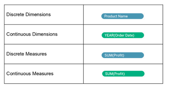
3. How Will You Understand Dimensions and Measures?
Dimensions
Measures
Dimensions contain qualitative values (such as names, dates, or geographical data)
Measures contain numeric, quantitative values that you can measure (such as Sales, Profit)
You can use dimensions to categorize, segment, and reveal the details in your data.
Measures can be aggregated
Example: Category, City, Country, Customer ID, Customer Name, Order Date, Order ID
Example: Profit, Quantity, Rank, Sales, Sales per Customer, Total Orders
4. What is Meant by ‘discrete’ and ‘continuous’ in Tableau?
The use of Tableau’s Discrete fields always results in headers being drawn whenever they are placed on the Rows or Columns shelves. On the other hand, Tableau Continuous fields always result in axes when you add them to the view.
Continuous in Tableau will give you an overall trend of the data that you are looking at. While Discrete in Tableau allows you to segment the data to analyze it in different ways. Moreover, Tableau’s Discrete function gives you the chance to take something that would be the cumulative total of something and break it down into segments or chunks and see your data in different ways. This is not something that Excel can easily do. Changing these can affect how you present information. Discrete data in Tableau is always represented with a blue pill on the shelf, while Continuous data in Tableau is always green.
Discrete – “individually separate and distinct.”
Continuous – “forming an unbroken whole without interruption.”
The values are as shown:
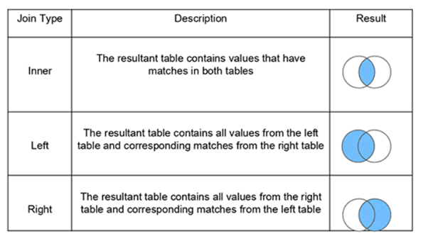
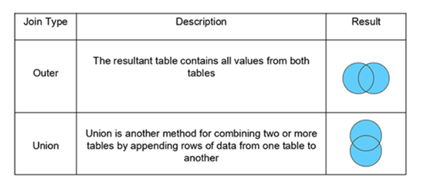
5. What Are the Different Joins in Tableau?
Joining is a method for combining related data on a common key. Below is a table that lists the different types of joins:
6. What is the Difference Between a Live Connection and an Extract?
Tableau Data Extracts are snapshots of data optimized for aggregation and loaded into system memory to be quickly recalled for visualization.
Example: Hospitals that monitor incoming patient data need to make real-time decisions.
Live connections offer the convenience of real-time updates, with any changes in the data source reflected in Tableau.
Example: Hospitals need to monitor the patient’s weekly or monthly trends that require data extracts.
Note:-
When you create an extract of the data, Tableau doesn’t need access to the database to build the visualization, so processing is faster.
If you have a Tableau server, the extract option can be set to a refresh schedule to be updated.
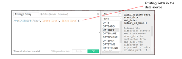
7. What is a Calculated Field, and How Will You Create One?
A calculated field is used to create new (modified) fields from existing data in the data source. It can be used to create more robust visualizations and doesn’t affect the original dataset.
For example, let’s calculate the “average delay to ship.”
The data set considered here has information regarding order date and ship date for four different regions. To create a calculated field:
Go to Analysis and select Create Calculated Field.
A calculation editor pops up on the screen. Provide a name to the calculated field: Shipping Delay.
Enter the formula: DATEDIFF (‘day’, [Order Date], [Ship Date])
Click on Ok.
Bring Shipping Delay to the view.
Repeat steps 1 to 5 to create a new calculated field ‘Average Shipping Delay’ using the formula: AVG (DATEDIFF (‘day,’ [Order Date], [Ship Date]))
7. Drag Region field to Rows shelf and SUM(Average Shipping Delay) to the marks card; the average delay for each region gets displayed.
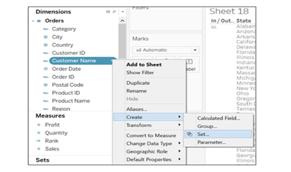
8. How Can You Display the Top Five and Bottom Five Sales in the Same View?
We can display it using the In/Out functionality of sets.
Follow these steps:
Drag the Customer Name field to Rows shelf and Profit field to Columns shelf to get the visualization.
Create a set by right-clicking on the Customer Name field. Choose to create an option and click on Set.
Provide the name ‘Top Customers’ to the set. Configure the set by clicking on Top tab, selecting By field, and filling the values as Top, 5, Profit, and Sum.
Similarly, create a second set called ‘Bottom Customers’ and fill the By Field values as Bottom, 5, Profit, and Sum.
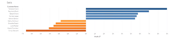
Select these two sets and right-click on it. Use the option Create Combined Set. Name it ‘Top and Bottom Customers’ and include all members of both sets. Pull the Top and Bottom Customers onto Filters
The top five and bottom five are displayed:
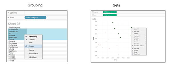
9. Is There a Difference Between Sets and Groups in Tableau?
A Tableau group is one dimensional, used to create a higher level category by using lower-level category members. Tableau sets can have conditions and can be grouped across multiple dimensions/measures.
Example: Sub-category can be grouped by category.
Top Sales and profit can be clubbed together for different categories by creating a set:
Continuing with the above example of Sets, select the Bottom Customers set where customer names are arranged based on profit.
Go to the ‘Groups’ tab and select the top five entries from the list.
Right-click and select create a group option.
Similarly, select the bottom five entries and create their group. Hide all the other entries.
A key difference here is that the groups will consist of the same customers even if their profits change later. While for sets, if the profit changes, the top five and bottom five customers will change accordingly.
Note-
We can’t use groups in calculated fields, but we can use sets.
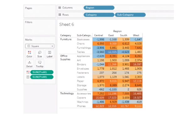
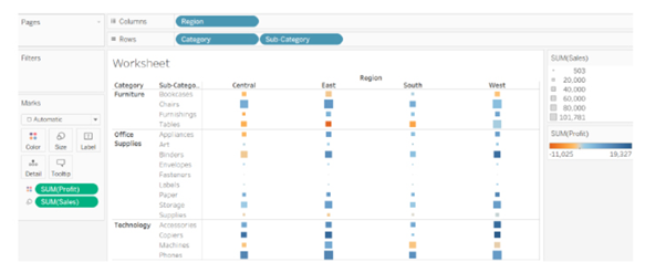
10. What is the Difference Between Treemaps and Heat Maps?
Heat Maps
A Heat map is used to compare categories using color and size. In this, we can distinguish two measures.
Scenario: Show sales and profit in all regions for different product categories and sub-categories.
Follow these steps:
Drag Region field to Columns shelf, and Category and Sub-Category fields in Rows shelf.
Use the ShowMe tool and select the Heat Map.
Observe the hotter and colder regions in the heat map produced:
A heat map is not only defined by color, but you can also use its size. Here we define the size by sale by dragging the Sales tab to Size under marks card, comparing profit and sales through the color and size.
Analysis: Profit is represented by color and ranges from orange for loss to blue for profit. The total sales are represented by size.
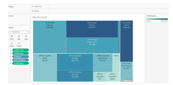
Tree Maps
A Treemap is used to represent hierarchical data. The space in the view is divided into rectangles that are sized and ordered by a measure. Scenario: Show sales and profit in all regions for different product categories and sub-categories.
Select two dimensions Category and Sub-Category
Select two measures Sales and Profit from the data pane.
Use the Show-me tool and select tree-map.
This is how it looks:
Analysis: The larger the size of the node, the higher the profit in that category. Similarly, the darker the node, the more sales in that category.
.twbx
The .twbx contains all of the necessary information to build the visualization along with the data source. This is called a packaged workbook, and it compresses the package of files altogether.
.twb
The .twb contains instructions about how to interact with the data source. When it’s building a visualization, Tableau will look at the data source and then build the visualization with an extract. It can’t be shared alone as it contains only instructions, and the data source needs to be attached separately.
11. Explain the Difference Between Tableau Worksheet, Dashboard, Story, and Workbook?
Tableau uses a workbook and sheet file structure, much like Microsoft Excel.
A workbook contains sheets, which can be a worksheet, dashboard, or a story.
A worksheet contains a single view along with shelves, legends, and the Data pane.
A dashboard is a collection of views from multiple worksheets.
A story contains a sequence of worksheets or dashboards that work together to convey information.
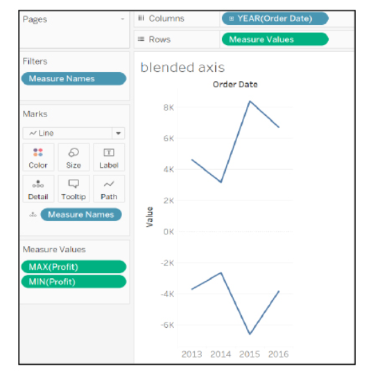
12. What Do You Understand the Blended Axis?
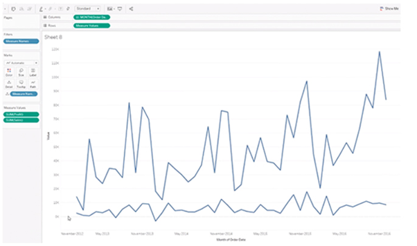
Blended Axis is used to blend two measures that share an axis when they have the same scale.
Scenario: Show Min and Max profit in the same pane and have a unified axis for both, so that it is quicker and easier to interpret the chart.
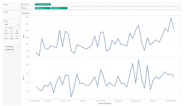
First, create a visualization that shows sales over time. Next, see profit along with sales over the same time. Here, you get two visualizations, one for sales over time and the other for-profit over time.
To see a visualization that has a blended axis for sales over time and profit over time, we bring in Measure Values and select the properties that we want to keep (Sales and Profit), removing all of the rest. You can now see profit and sales over one blended axis.
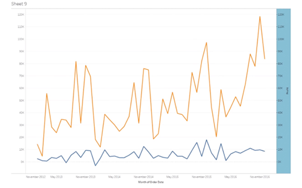
13. What is the Use of Dual-axis? How Do You Create One?
Dual Axis allows you to compare measures, and this is useful when you want to compare two measures that have different scales.
Considering the same example used in the above question, first create a visualization with sales over time and profit over time. To create a dual-axis, right-click on the second pill of the measures and select Dual Axis.
Observe that sales and profit do not share the same axis, and profit is much higher towards the end.
The difference between a blended axis and a dual-axis chart is that the blended axis uses the same scale, while a dual-axis could have two different scales and two marks cards.
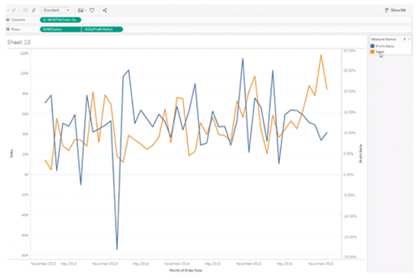
Scenario: We want to show Sales by year and Profit Ratio by year in the same view.
We create a visualization of sales over time and profit ratio over time. Observe that sales and profit ratio can’t use the same scale as the profit ratio is in percentage. As we want the two parameters in the same area, we right-click on Profit Ratio and select Dual Axis.
14. What is the Rank Function in Tableau?
The ranking is assigning something a position usually within a category and based on a measure. Tableau can rank in several ways like:
rank
rank_dense
rank_modified
rank_unique
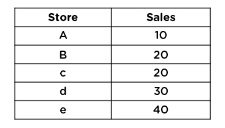
Consider five stores whose sales are as shown:
Let us understand how they are ranked based on their sales:
Drag Store field to Rows shelf and Sales field to the marks card.
Create a Calculated Field named Rank and use the formula: RANK (SUM(Sales))
Bring the Rank field to the marks card.
Double-click on the Rank field, and you can see the rank assigned to the stores based on sales.
Next, duplicate the Rank field by right-clicking on it and selecting Duplicate. Name the copy as ‘Rank Modified’ and use the formula:
RANK MODIFIED (SUM(Sales))
Bring Rank Modified to the marks card to view the data.
Repeat the same steps to create ‘Rank Dense’ and use the formula:
RANK DENSE (SUM(Sales))
Similarly, create ‘Rank Unique’ and use the formula:
RANK UNIQUE (SUM(Sales))
15. How Do You Handle Null and Other Special Values?
If the field contains null values or if there are zeros or negative values on a logarithmic axis, Tableau cannot plot them. Tableau displays an indicator in the lower right corner of the view, and you can click the indicator and choose from the following options:
Filter Data Excludes the null values from the visualization using a filter. In that case, the null values are also excluded from any calculations used in the view.
Show Data at Default Position Shows the data at a default location on the axis.
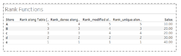
16. Design a View to Show Region Wise Profit and Sales.
Follow these simple steps to show region wise profit and sales:
Drag Profit and Sales field to the Rows shelf
Drag Region field to the Columns shelf
But for such questions, the interviewer may be looking for your mapping capabilities in Tableau.
So, you need to follow these steps to show region wise profit and sales in a better way:
Double click on the State field to get its view
Go to Marks card and change the mark type from Automatic to Map.
Bring Region field to Color on the Marks card
Drag Profit, Sales, and State fields to Label on the Marks card
These steps produce a better view of region-wise profit and sales, as shown:
17. How Can You Optimize the Performance of a Dashboard?
There are multiple ways to optimize the performance of the dashboard like:
Maximize the number of fields and records. You can exclude unused fields from your visualization or use extract filters.
Limit the number of filters used, by avoiding quick filters and using action and parameter filters instead. These filters reduce query loads.
use Min/Max instead of Average because average functions require more processing time than Min/Max
Use boolean or numerical calculations more than string calculations. Computers can process integers and boolean much faster than strings.
Boolean > int > float > date-time > string
18. What are the different kinds of filters in Tableau?
Tableau offers a good range of filters that we can apply on the data for better analysis.
Filters allow us to view our data at different levels of granularity and detail. We can exclude unnecessary data through filters and conduct our analysis on only the required data. There are five different types of filters available in Tableau.
1. Extract filters: These filters create an extract or subset of data from the original data source.
In other words, the extract filters extract a portion of data from the whole from its source. We can use the data extract anywhere in the analysis once it is created.
2. Data Source filters: The data source filters are the filter conditions that we can directly apply at the data source level.
Using the data source filters we can apply filters on the data present in the data source itself instead of first importing it into Tableau.
3. Context filters: The context filters are used to apply a context for the data that we are working on.
Once we apply a context filter on a worksheet or workbook, the entire analysis is done in that applied context only.
4. Dimension filters: Dimension filters are applied specifically on individual dimensions present in the Dimensions section on a Tableau sheet.
We can easily apply dimension filters on the dimension fields by dragging and dropping the field into the Filter card present on the sheet.
5. Measure filters: Such filters are applied on individual measure fields present in the Measures section on a Tableau sheet.
We can easily apply the measure filters on the measure fields by dragging and dropping the field into the Filter card present on the sheet.
19. What do you understand by context filters?
Context filters are used to apply context on the data under analysis.
By applying a context we set a perspective according to which we can see the charts and graphs.
For example, we have sales data of an electronic store and we want to conduct our analysis only for the corporate sector or segment.
To do this, we have to apply a context filter on our Tableau sheet. Once we add the context for the Corporate segment from the Add to context option, all the charts present on the sheet will only show data relevant to the Corporate segment.
In this way, we can apply a context to our analysis in Tableau.
20. What is Quick Sorting in Tableau?
Tableau gives us the option to Quick Sort data present in our visualizations.
We can instantly sort data from the visualization by simply clicking on the sort button present on the axes of a graph or chart.
An ascending sort is performed upon one click, the descending sort is performed on two clicks and an applied sort is cleared on three clicks on the Quick Sort icon.
21. What is Data Blending in Tableau?
Consider the same client. Suppose, they are operating their services in Asia, Europe, NA, and so on, and they are maintaining Asia data in SQL, Europe data in SQL Server, and NA data in MySQL.
Now, our client wants to analyze their business across the world in a single worksheet. In this case, we can’t perform a Join. Here, we have to make use of the data blending concept.
Normally, in Tableau, we can perform the analysis on a single data server. If we want to perform the analysis of data from multiple data sources in a single sheet, then we have to make use of this new concept called data blending.
Data blending mixes the data from different data sources and allows users to perform the analysis in a single sheet. ‘Blending’ means ‘mixing’ and when we are mixing the data sources, then it is called data blending.
Rules to Perform Data Blending
In order to perform data blending, there are a few rules:
If we are performing data blending on two data sources, these two data sources should have at least one common dimension.
In that common dimension, at least one value should be matching.
In Tableau, we can perform data blending in two ways.
Automatic way: Here, Tableau automatically defines the relationship between the two data sources based on the common dimensions and based on the matching values, and the relationship is indicated in orange.
Custom or Manual way: In the manual or custom way, the user needs to define the relationship manually.
Data Blending Functionality
All the primary and secondary data sources are linked by a specific relationship.
While performing data blending, each worksheet has a primary connection, and optionally it might contain several secondary connections.
All the primary connections are indicated in blue in the worksheet and all the secondary connections with an orange-colored tick mark.
In data blending, one sheet contains one primary data source and it can contain n number of secondary data sources.
22. What is the use of the new custom SQL query in Tableau?
Custom SQL query is written after connecting to data for pulling the data in a structured view. For example, suppose, we have 50 columns in a table, but we need just 10 columns only. So instead of taking 50 columns, we can write a SQL query. The performance will increase.
23. How to create cascading filters without using context filter?
Here, say, we have Filter1 and Filter2. Based on Filter1, we need to use Filter2 on the data. For example, consider Filter1 as ‘Country’ and Filter2 as ‘States.’
Let’s choose Country as ‘India’ and hence Filter2 should display only the states of India. Choose options of Filter2 states: select option of ‘Only relevant values’
24. How can we combine a database and the flat file data in Tableau Desktop?
Connect data twice, once for database tables and then for the flat file. The Data->Edit Relationships
Give a Join condition on the common column from DB tables to the flat file.
25. How will you publish and schedule a workbook in Tableau Server?
First, create a schedule for a particular time and then create Extract for the data source and publish the workbook on the server.
Before we publish it, there is an option called ‘Scheduling and Authentication’. Click on that and select the schedule from the drop-down and then publish. Also publish data source and assign the schedule. This schedule will automatically run for the assigned time and the workbook will get refreshed on a regular basis.
26. Distinguish between Parameters and Filters.
Parameters are dynamic values that can replace constant values in calculations. Parameters can serve as Filters as well.
Filters, on the other hand, are used to restrict the data based on a condition that we have mentioned in the Filters shelf.
27. How to view a SQL generated by Tableau Desktop?
Tableau Desktop Log files are located in C:/Users/MyDocuments/My Tableau Repository. If we have a live connection to the data source, we need to check the log.txt and tabprotosrv.txt files. If we are using Extract, have to check the tdeserver.txt file. The tabprotosrv.txt file often shows detailed information about queries.
28. What are the five main products offered by Tableau?
Tableau offers five main products:
Tableau Desktop
Tableau Server
Tableau Online
Tableau Reader
Tableau Public
Tableau Desktop
Tableau Desktop has a rich feature set and allows you to code and customize reports. It ables users to create charts, reports, and dashboards.
Tableau Public
It is the Tableau version specially build for cost-effective users. By the word “Public,” it means that the workbooks created cannot be saved locally. In turn, it should be saved to Tableau’s public cloud, which can be viewed and accessed by anyone.
Tableau Server
The software is specifically used to share the workbooks, visualizations that are created in the Tableau Desktop application across the organization.
Tableau Online
As the name suggests, it is an online sharing tool for Tableau. Its functionalities are similar to Tableau Server, but the data is stored on servers hosted in the cloud, which are maintained by the Tableau group.
Tableau Reader
Tableau Reader is a free tool that enables the user to view the workbooks and visualizations created using Tableau Desktop or Tableau Public. The data can be filtered, but editing and modifications are restricted. The security level is zero in Tableau Reader as anyone who gets the workbook can view it using Tableau Reader.
29. What are the advantages of Using Context Filters?
The advantages of Using Context Filters
Improve Performance: When context filter is used in large data sources, it can improve the performance as it creates a temporary dataset part based on the context filter selection. The performance can be effectively improved through the selection of major categorical context filters.
Dependent Filter Conditions: Context filters can be used to create dependent filter conditions based on the business requirement. When the data source size is large, context filters can be selected on the primary category, and other relevant filters can be executed.
30. Explain story in Tableau
A story is a sheet containing a dashboard or worksheet sequence that works together to convey particular information.
31. Distinguish between Treemaps and Heat Maps
TreeMap
Heat Map
TreeMap represents and shows data hierarchically as a group of nested rectangles.
Heat Map represents the data graphically with multiple colors to represent values.
It can be used for comparing the categories with size, colors, and illustrating the hierarchical data.
It can be used for comparing the categories depend on size and color.
32. Explain data modelling
Data modeling (data modeling) is the process of creating a data model for the data to be stored in a database.
This data model is a conceptual representation of Data objects, the associations between different data objects, and the rules. Data modeling helps in the visual representation of data and enforces business rules, regulatory compliances, and government policies on the data.
33. Name the components of a Dashboard.
Important components of a Dashboard are:
Horizontal: A horizontal layout allows the designer to group dashboard components and worksheets across the page.
Vertical: Vertical containers enables the user to group dashboard components and worksheets top to bottom down your page. It also allows users to edit the width of all elements at once.
Text: It contains all textual files
Image Extract: Tableau applies some code to extract the image that is stored in XML.
URL action: It is a hyperlink that points to file, web page, or other web-based resources.
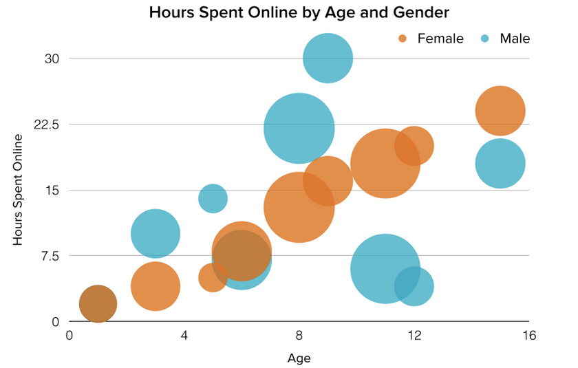
34. What are the different Types of Graphs and Charts for Presenting Data?
To better understand each chart and how they can be used, here’s an overview of each type of chart.
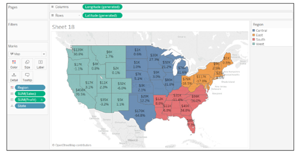
1. Column Chart:
A column chart is used to show a comparison among different items, or it can show a comparison of items over time. You could use this format to see the revenue per landing page or customers by close date.
Image Source: blog.hubspot.com
Design Best Practices for Column Charts:
Use consistent colors throughout the chart, selecting accent colors to highlight meaningful data points or changes over time.
Use horizontal labels to improve readability.
Start the y-axis at 0 to appropriately reflect the values in your graph.
2. Bar Graph:
A bar graph, basically a horizontal column chart, should be used to avoid clutter when one data label is long or if you have more than 10 items to compare. This type of visualization can also be used to display negative numbers.
Design Best Practices for Bar Graphs:
Use consistent colors throughout the chart, selecting accent colors to highlight meaningful data points or changes over time.
Use horizontal labels to improve readability.
Start the y-axis at 0 to appropriately reflect the values in your graph.
3. Line Graph:
A line graph reveals trends or progress over time and can be used to show many different categories of data. You should use it when you chart a continuous data set.
Design Best Practices for Line Graphs:
Use solid lines only.
Don’t plot more than four lines to avoid visual distractions.
Use the right height so the lines take up roughly 2/3 of the y-axis’ height.
4. Dual Axis Chart:
A dual axis chart allows you to plot data using two y-axes and a shared x-axis. It’s used with three data sets, one of which is based on a continuous set of data and another which is better suited to being grouped by category. This should be used to visualize a correlation or the lack thereof between these three data sets.
Design Best Practices for Dual Axis Charts:
Use the y-axis on the left side for the primary variable because brains are naturally inclined to look left first.
Use different graphing styles to illustrate the two data sets, as illustrated above.
Choose contrasting colors for the two data sets.
5. Area Chart:
An area chart is basically a line chart, but the space between the x-axis and the line is filled with a color or pattern. It is useful for showing part-to-whole relations, such as showing individual sales reps’ contribution to total sales for a year. It helps you analyze both overall and individual trend information.
Design Best Practices for Area Charts:
Use transparent colors so information isn’t obscured in the background.
Don’t display more than four categories to avoid clutter.
Organize highly variable data at the top of the chart to make it easy to read.
6. Stacked Bar Chart:
This should be used to compare many different items and show the composition of each item being compared.
Design Best Practices for Stacked Bar Graphs:
Best used to illustrate part-to-whole relationships.
Use contrasting colors for greater clarity.
Make chart scale large enough to view group sizes in relation to one another.
7. Mekko Chart:
Also known as a marimekko chart, this type of graph can compare values, measure each one’s composition, and show how your data is distributed across each one.
It’s similar to a stacked bar, except the mekko’s x-axis is used to capture another dimension of your values — rather than time progression, like column charts often do. In the graphic below, the x-axis compares each city to one another.
Design Best Practices for Mekko Charts:
Vary you bar heights if the portion size is an important point of comparison.
Don’t include too many composite values within each bar. you might want to reevaluate how to present your data if you have a lot.
Order your bars from left to right in such a way that exposes a relevant trend or message.
8. Pie Chart:
A pie chart shows a static number and how categories represent part of a whole — the composition of something. A pie chart represents numbers in percentages, and the total sum of all segments needs to equal 100%.
Design Best Practices for Pie Charts:
Don’t illustrate too many categories to ensure differentiation between slices.
Ensure that the slice values add up to 100%.
Order slices according to their size.
9. Scatter Plot Chart:
A scatter plot or scattergram chart will show the relationship between two different variables or it can reveal the distribution trends. It should be used when there are many different data points, and you want to highlight similarities in the data set. This is useful when looking for outliers or for understanding the distribution of your data.
Design Best Practices for Scatter Plots:
Include more variables, such as different sizes, to incorporate more data.
Start y-axis at 0 to represent data accurately.
If you use trend lines, only use a maximum of two to make your plot easy to understand.
10. Bubble Chart:
A bubble chart is similar to a scatter plot in that it can show distribution or relationship. There is a third data set, which is indicated by the size of the bubble or circle.
Design Best Practices for Bubble Charts:
Scale bubbles according to area, not diameter.
Make sure labels are clear and visible.
Use circular shapes only.
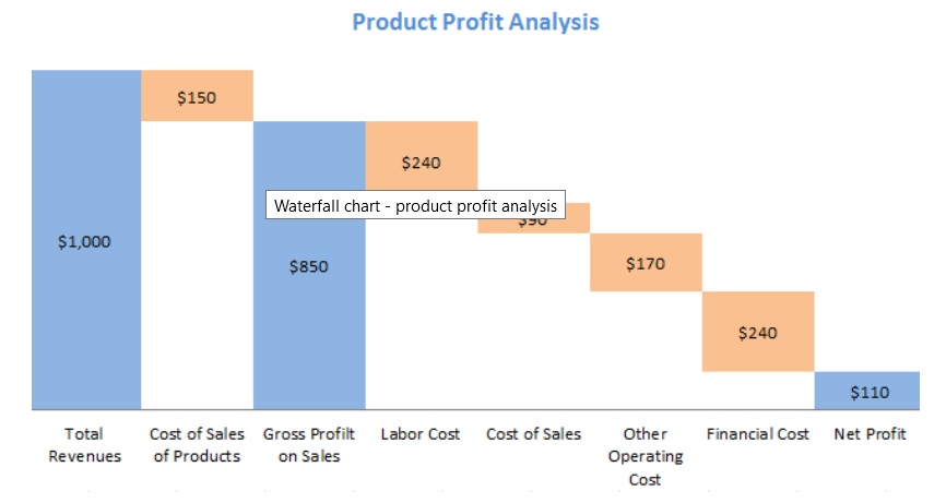
11. Waterfall Chart:
A waterfall chart should be used to show how an initial value is affected by intermediate values — either positive or negative — and resulted in a final value. This should be used to reveal the composition of a number. An example of this would be to showcase how overall company revenue is influenced by different departments and leads to a specific profit number.
Design Best Practices for Waterfall Charts:
Use contrasting colors to highlight differences in data sets.
Choose warm colors to indicate increases and cool colors to indicate decreases.
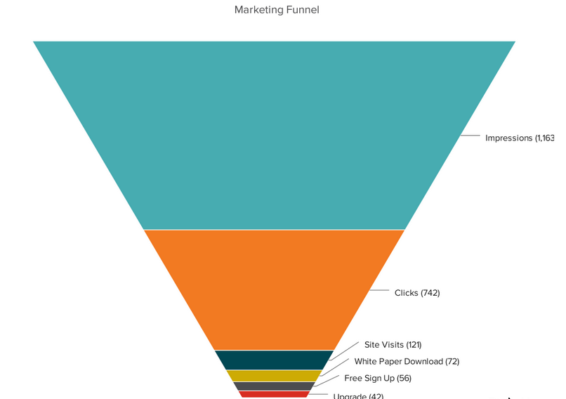
12. Funnel Chart:
Design Best Practices for Funnel Charts:
Scale the size of each section to accurately reflect the size of the data set.
Use contrasting colors or one color in gradating hues, from darkest to lightest as the size of the funnel decreases.
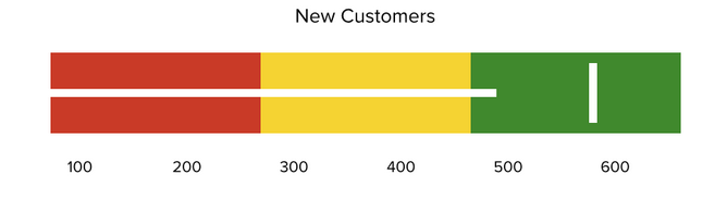
13. Bullet Graph:
A bullet graph reveals progress toward a goal, compares this to another measure, and provides context in the form of a rating or performance.
Design Best Practices for Bullet Graphs:
Use contrasting colors to highlight how the data is progressing.
Use one color in different shades to gauge progress.
14. Heat Map:
A heat map shows the relationship between two items and provides rating information, such as high to low or poor to excellent. The rating information is displayed using varying colors or saturation.
Image source: blog.hubspot.com
Design Best Practices for Heat Map:
Use a basic and clear map outline to avoid distracting from the data.
Use a single color in varying shades to show changes in data.
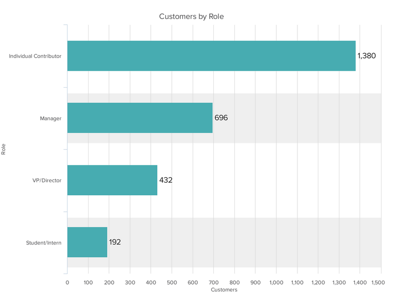
In today environment there is a high competitiveness which increase pressure on employee. High competitiveness leads unachievable goals, which cause an employee health issues, and health issue will lead absenteeism of employee.
With a given dataset an organisation is trying to predict employee absenteeism.
What is absenteeism in the business context?
Absence from work during normal working hours, resulting in temporary incapacity to execute regular working activity.
Purpose Of Model:
Explore whether a person presenting certain characteristics is expected to be away from work at some points in time or not.
Dataset:
I have downloaded a data set from kaggle called ‘Absenteeism_data.csv’ which contain following information.
Reason_1 – A Type of Reason to be absent.
Reason_2 – A Type of Reason to be absent.
Reason_3 – A Type of Reason to be absent.
Reason_4 – A Type of Reason to be absent.
Month Value – Month in which employee has been absent.
Day of the Week – Days
Transportation Expense – Expense in dollar
Distance to Work – Distance of workplace in Km
Age – Age of employee
Daily Work Load Average – Average amount of time spent working per day shown in minutes.
Body Mass Index – Body Mass index of employee.
Education – Education category(1 – high school education, 2 – Graduate, 3 – Post graduate, 4 – A Master or Doctor )
Children – No of children an employee has
Pet – Whether employee has pet or not?
Absenteeism Time in Hours – How many hours an employee has been absent.
Following are the main action we will take in this project.
Build the model in python
Save the result in Mysql.
Visualise the end result in Tableau
Python for model building:
We are going to take following steps to predict absenteeism:
Load the data
Import the ‘Absenteeism_data.csv’ with the help of pandas
Identify dependent Variable i.e. identify the Y:
We have to be
categories and we must find a way to say if someone is ‘being absent too much’
or not. what we’ve decided to do is to take the median of the dataset as a
cut-off line in this way the dataset will be balanced (there will be roughly
equal number of 0s and 1s for the logistic regression) as balancing is a great
problem for ML, this will work great for us alternatively, if we had more data,
we could have found other ways to deal with the issue for instance, we could
have assigned some arbitrary value as a cut-off line, instead of the median.
Note that what line does is to assign 1 to anyone who has been absent 4 hours or more (more than 3 hours) that is the equivalent of taking half a day off initial code from the lecture targets = np.where(data_preprocessed[‘Absenteeism Time in Hours’] > 3, 1, 0)
Choose Algorithm to develop model:
As our Y (dependent variable) is 1 or o i.e. absent or not absent so we are going to use Logistic regression for our analysis.
Select Input for the regression:
We have to select our all x variables i.e. all independent variable which we will use for regression analysis.
Data Pre-processing:
Remove or treat missing value
In our case there is no missing value so we don’t have to worry about missing value. Yes, there are some columns who is not adding any value in our analysis such as ID which is unique in every case so we will remove it.
Remove Outliers
In our case there are no outliers so we don’t have to worry. But in general if you have outlier you can take log of your x variable to remove outliers.
Standardize the data
standardization is one of the most common pre-processing tools since data of different magnitude (scale) can be biased towards high values, we want all inputs to be of similar magnitude this is a peculiarity of machine learning in general – most (but not all) algorithms do badly with unscaled data. A very useful module we can use is Standard Scaler. It has much more capabilities than the straightforward ‘pre-processing’ method. We will create a variable that will contain the scaling information for this particular dataset.
In this section we need to choose that variable which need to transform or scale.in our case we need to scale [‘Reason_1’, ‘Reason_2’, ‘Reason_3’, ‘Reason_4′,’Education’, pet and ‘children’], because these are the columns which contain categorical data but in numerical form so we need to transform them.
What about the other column?
‘Month Value’, ‘Day of the Week’, ‘Transportation Expense’, ‘Distance to Work’, ‘Age’, ‘Daily Work Load Average’, ‘Body Mass Index’ . These are the numerical value and their data type is int. so we do not have to transform them but will keep in our analysis.
Note:-
You can ask why we are doing analysis manually column wise?
Because it is always good to analyse data feature wise it gives us a confidence for our model and we can easily interpret our model analysis.
Split Data into train and test
Divide our data into train and test and build the model on train data set.
Apply Algorithm
As per our scenario we are going to use logistic regression in our case. Following steps will take place
Train the model
First we will divide the data into train and test. We will build our model on train data set.
Test the model
When we successfully developed our model then we need to test with a new data set which is testing data sets.
Find the intercepts and coefficient
Find out the beta values and coefficient from model.
Interpreting the coefficients
Find out which feature is adding more values in predictions of Y.
Save the model
Need to save the model which we
have prepared so far. To do that we need to pickle the model.
Two executable file will save in
your python directory one ‘model’ and the
other is ‘scaler’
To save your .Ipnyb file in form of executable, save the same as .py file.
Check Model performance on totally new data set with same features.
Now we have a totally new data set
which has same feature as per previous data set but contain different values.
Note – To do that your executable file ‘model’, scaler’ and ‘.py’ file should be in same folder.
Mysql for Data store
Save the prediction in data base (Mysql)
It is always good to save data
and prediction on centralised data base. So create a data base in mysql and create a
table with all field available in your predicted data frame i.e ‘df_new_obs’
Import ‘pymysql’ library to make connection between ipynb notebook and mysql.
Setup the connection with user name and password and insert the predicted output values. In the data base.
Tableau for Data visualization
Connect the data base with Tableau and visualize the result
As we know tableau is a strong tool to visualise the data. So in our case we will connect our database with tableau and visualise our result and present to the business.
To
connect tableau with my sql we need to take following steps.
Open the tableau desktop application.
Click on connect data source as mysql.
Put your data base address, username and password.